Font of the week: Gotham
Gotham is a family of geometric sans-serif digital typefaces designed by American type designer Tobias Frere-Jones in 2000. Gotham's letterforms are inspired by a form of architectural signage that achieved popularity in the mid-twentieth century, and are especially popular throughout New York City.
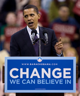
Since creation, Gotham has been highly visible due to its appearance in many notable places, including a large amount of campaign material created for Barack Obama's 2008 presidential campaign, as well as the cornerstone of the One World Trade Center, the tower to be built on the site of the former World Trade Center in New York.The Gotham font was initially commissioned by GQ magazine, whose editors wanted to display a sans-serif with a "geometric structure" that would look "masculine, new, and fresh" for their magazine. Although the magazine was initially considering a series of fonts that either looked like techno CD covers or were more traditional like Futura, they agreed that they needed something "that was going to be very fresh and very established to have a sort of credible voice to it," according to Jonathan Hoefler.
Frere-Jones' inspiration for the typeface came from time spent walking block-by-block through Manhattan with a camera to find source material, and he based the font on the lettering seen in older buildings, especially the sign on the Eighth Avenue facade of the Port Authority Bus Terminal. "I suppose there's a hidden personal agenda in the design," Frere-Jones said, "to preserve those old pieces of New York that could be wiped out before they're appreciated. Having grown up here, I was always fond of the 'old' New York and its lettering."
The lettering that inspired this typeface originated from the style of 1920s era sans-serifs like Futura, where "Type, like architecture, like the organization of society itself, was to be reduced to its bare, efficient essentials, rid of undesirable, local or ethnic elements." This theme was found frequently in Depression-era type in both North America and Europe, particularly Germany.[4] This simplification of type is characterized by Frere-Jones as "not the kind of letter a type designer would make. It's the kind of letter an engineer would make. It was born outside the type design in some other world and has a very distinct flavor from that."
Reviews of Gotham focus on its identity as something both American and specific to New York City. According to David Dunlap of The New York Times, Gotham "deliberately evokes the blocky no-nonsense, unselfconscious architectural lettering that dominated the [New York] streetscape from the 1930's through the 1960's."Andrew Romano of Newsweek concurs. "Unlike other sans serif typefaces, it's not German, it's not French, it's not Swiss," he said. "It's very American."
According to Frere-Jones, Gotham wouldn't have happened without the GQ commission. "The humanist and the geometric ... had already been thoroughly staked out and developed by past designers. I didn't think anything new could have been found there, but luckily for me (and the client), I was mistaken."


